Saturday, January 30, 2010

Petrellis


I was going for a more cartoony/stylized approach with this one. I'm not super-satisfied with it, but I think it was a good attempt at another style.


Messing around with fleshtones and whatnot. I love the idea of highly-rendered areas being contrasted with highly-abstracted areas.

Tuesday, January 26, 2010

Tutorial Tuesday: Flesh Tones 1

Flesh tones can be pretty tricky. I've been analyzing photos of people in Photoshop, trying to get a sense of how flesh tones move through color space as they move through color space.

In my opinion, though the hue is a vital part of flesh tones, saturation and value are also very important. If the saturation or value are wrong, or they are plausible but painted in the wrong place, it will look muddy or out of place.

There's an abundance of skin types out there, but for now I'm just looking at an average Caucasian skin tone. Skin hue can have a pretty big range, but it seems like somewhere from 8 degrees to 15 degrees is a good starting place.
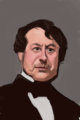

A Flesh Tone Sketch


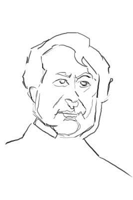
I've found a black and white photograph and done a rough sketch of it. I'm going to try and paint it with my own skin tones.

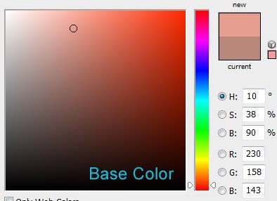
I'll start with a base color of 10 degrees hue, about 1/3 saturated, and a little under %100 value.

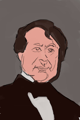
In step 2, I've filled in the image with some base colors.

In step 3, I took my base flesh tone and adjusted it in a few areas:

The cheeks and nose are redder.

The forehead is yellower.

The mouth area is yellower and a little darker.

None of these changes are dramatic. I only changed my hue setting about 5 degrees.

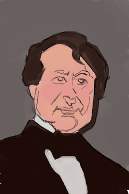
In step 4, I've added shadows. To get a shadow tone, I take my base tone and make it darker and a little more saturated. So far in my research, shadows seem to be a bit yellower too, but I'm not sure yet. Also, place shadows part by part, sampling your colors from the painting, so that you pick up the redder and yellower parts.

In step 5, I've added highlights. To get a highlight tone, I take my base tone and move it toward white. If you need to add a small area of shine, use (close to) pure white.

In step 6, I add the whites of the eyes, some mustache stubble (the original photograph didn't have stubble, but I added some for the heck of it), and the lips.

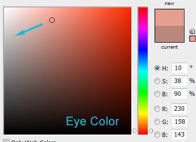
The white of the eye can be achieved by taking the base tone and making it less saturated and a little darker.

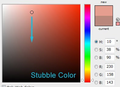
For stubble, take the base tone and make it darker.

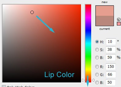
For lips colors, take the base tone and make it much redder (even done to around 350 degrees), darker, and more saturated.

That's what I've figured out so far. Next I'd like to look at different skin types and how pale or heavily tanned skin affects colors. Hope you enjoyed my little tutorial. I'm going to try and write one these every (or every other) Tuesday. We'll see how that goes. :D

Practice, practice

I've been re-watching heroes, which has made me want to paint the characters in it. I've used this to experiment with different styles and ideas.


From left to right:
Noah Bennet - Nothing special here. Just ended up using hatching for value.

Nathan Petrelli - Here, I was experimenting with the notion that, in painting, if you get the values right, the hues don't matter very much and the image will still look believable. However, I messed up a bit on the process. What did I do? I took three colors (a red, an orange, and a yellow), and placed them on a 3x3 pixel document along with 2 stages of gray for each pure color. I made the 3x3 area was made into a pattern (Edit -> Define Pattern) and then used the pattern to fill a second small document (about 200 x 50). Over the pattern I put a gradient that went from black to transparent to white. This document was my value scale. Now, on my main painting document, I set up a paint layer and then added a Hue/Saturation adjustment layer on top of it and set it to zero saturation. This way, I could paint onto the document with a colored brush, but it would show up as a gray. Now, all of this would have worked great, but for one problem in how Photoshop deals with saturation and value. We all know that a highly saturated yellow is much lighter than a highly saturated blue. However, in HSV color, both colors have the same value. Thus, when desaturated using Hue/Saturation, they both end up as the same shade of gray. Interestingly enough, it does change the colors' numeric value in the process--from %100 to %50, but it does not take into account inherent color value. Anyway, I did find a work-around: Instead of using a Hue/Saturation adjustment layer, use a regular layer set to the 'Saturation' blending mode and fill it with white. For some reason, here Photoshop will take color value into account. I'll have to give it another try with this corrected process. (Update: It turns out the effect I'm looking for can be created with the "Black & White" adjustment layer as well)

Peter Petrelli - Just a regular caricature. I'm pretty happy with how this one turned out. :)

Sylar - In this one I tried to keep my brush opacity rather high (80-100%) and pick my values carefully. Normally I use a combination of high and low opacity brushwork. I feel that high opacity work can add more life to a piece.

Ando - I cheated on this one. I traced my reference image, copied the traced layer into a new document, and fiddled with the proportions a bit before painting. I was just curious to see how it would affect the likeness.


The current Creature of the Week at ConceptArt.org is Zombie Dinosaur. I came up with the sketch on the left, but after I tired to color it, I was less than satisfied with the results. I feel like my colors are off, like they're sort of muddy or something. Sure it's a zombie, but they just don't look right. I also realized that the image was very static and boring. So I started a new one with a more action and a more interesting perspective. This is as far as I've gotten. I'll try a different approach to the color this time.


And, here are a few random sketches: (John Wayne from True Grit, an old cowboy from my imagination, a gecko)

Saturday, January 23, 2010

Colored Hatching

Lately I've been experimenting with hatching give my images a bit more vibrancy and texture. Here's an eagle study using this idea:


Also, here is a portrait of my girlfriend with some subtle hatching:


And some other random stuff:

Tuesday, January 12, 2010

Post-Christmas Update

I've been getting a lot of painting done recently, both traditionally and digitally. I'll try to post some of my traditional stuff as soon as I take some pictures.

Here's some sketches from my imagination:


Some paintings from references / observation:


A plein air painting from my trip to Hawaii:


Some paintings from observation from visiting my parent's house:

Followers

About Me